Design & Banding
Professional Training & Education Technology
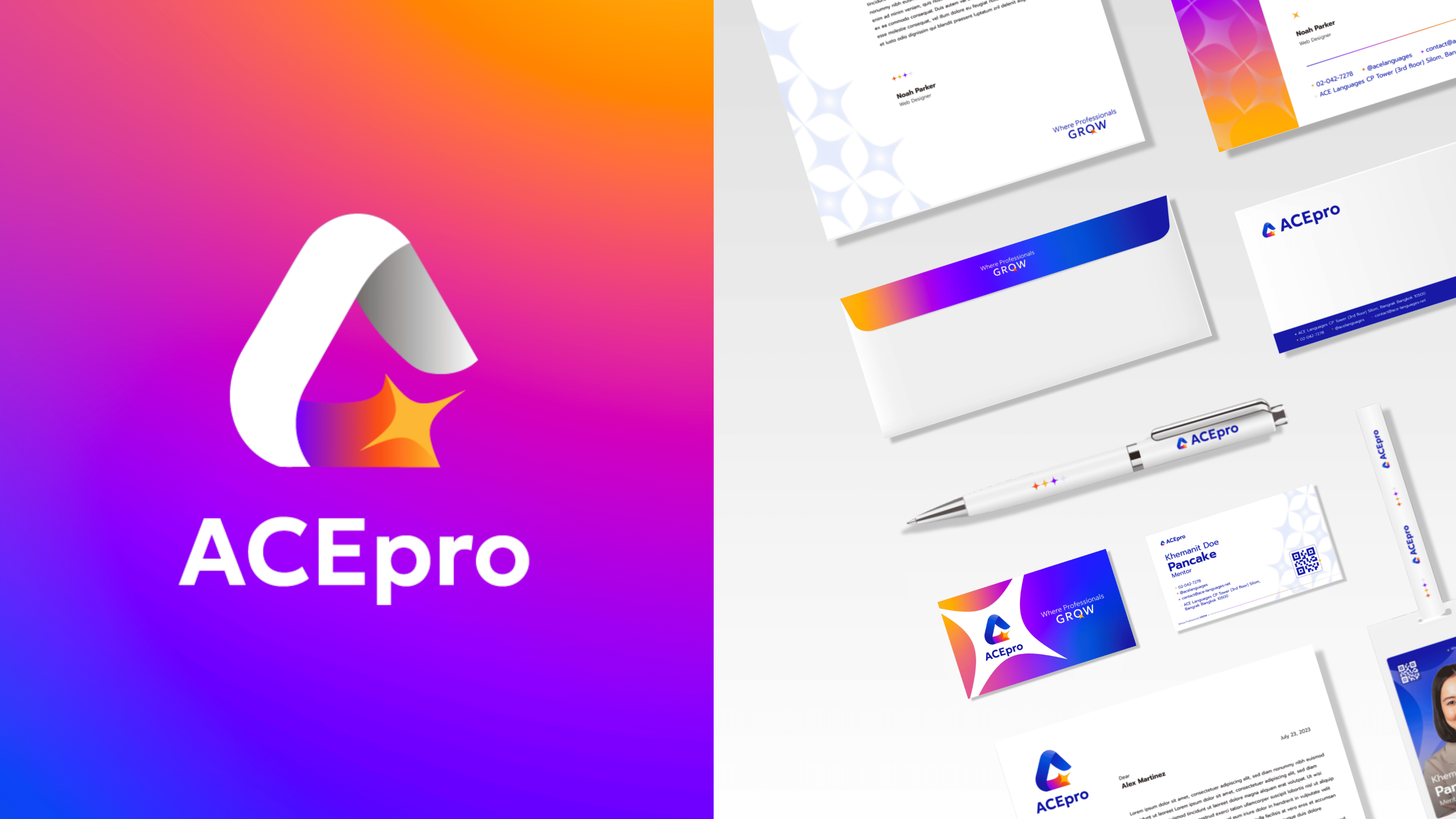
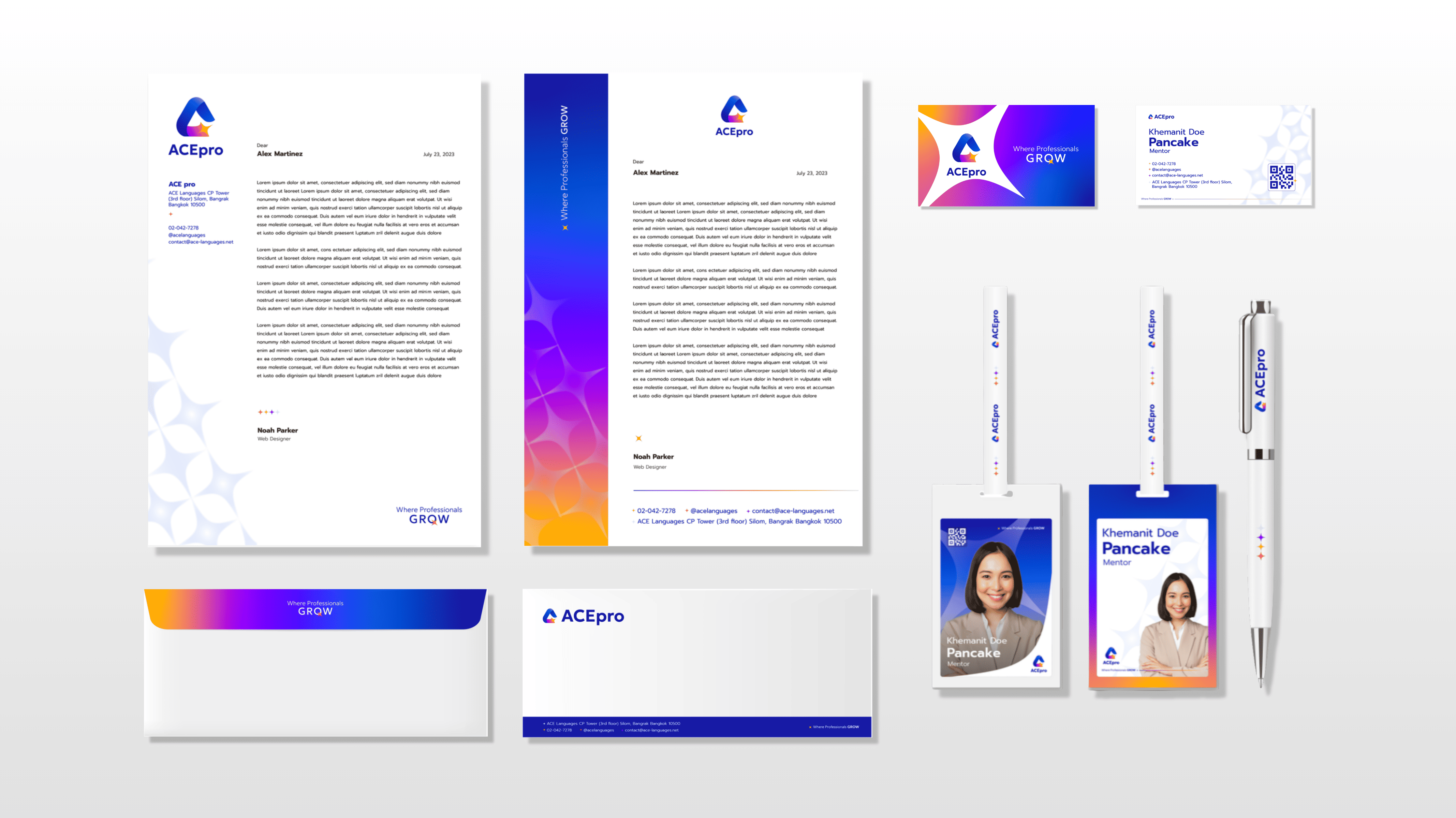
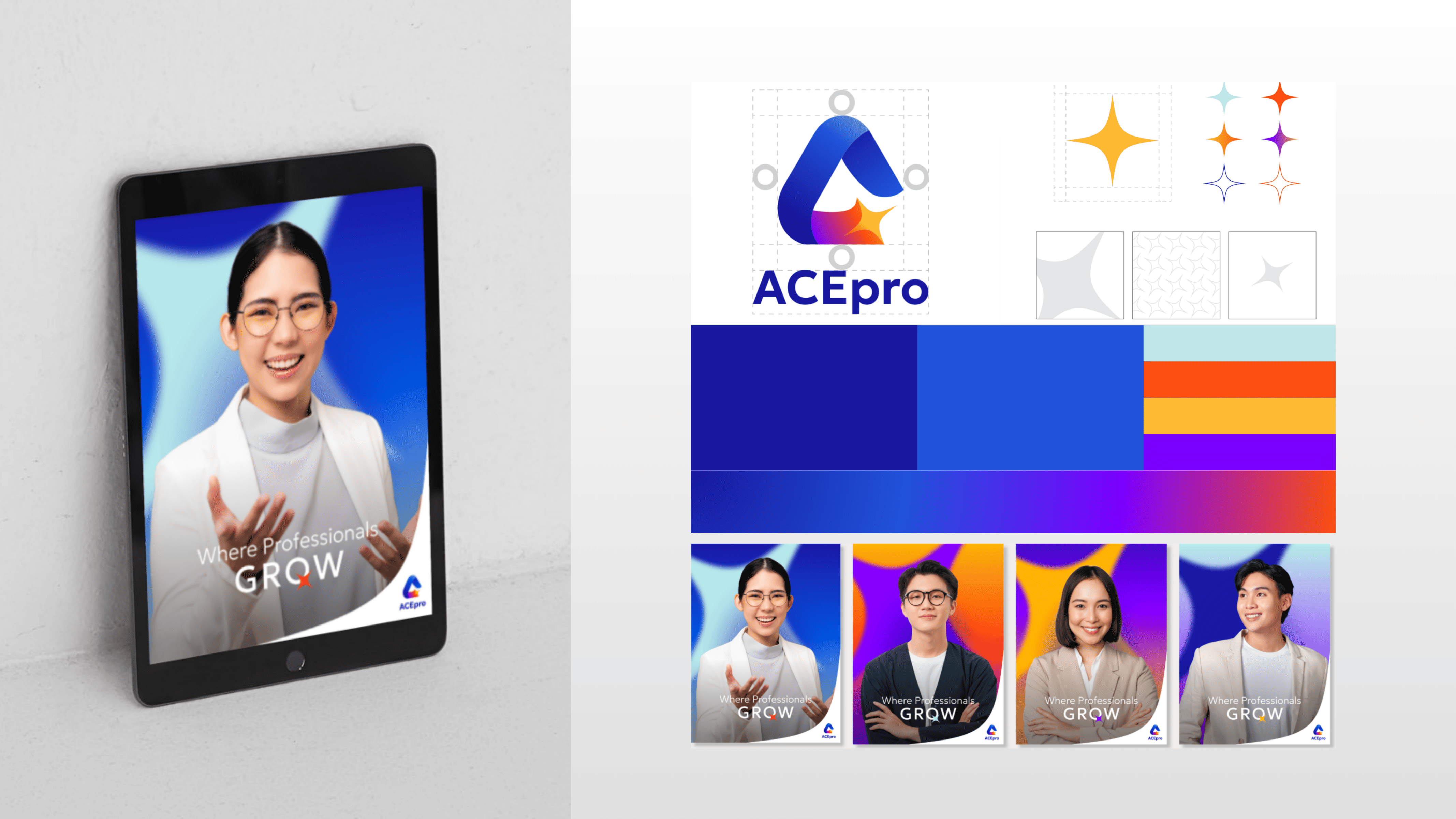
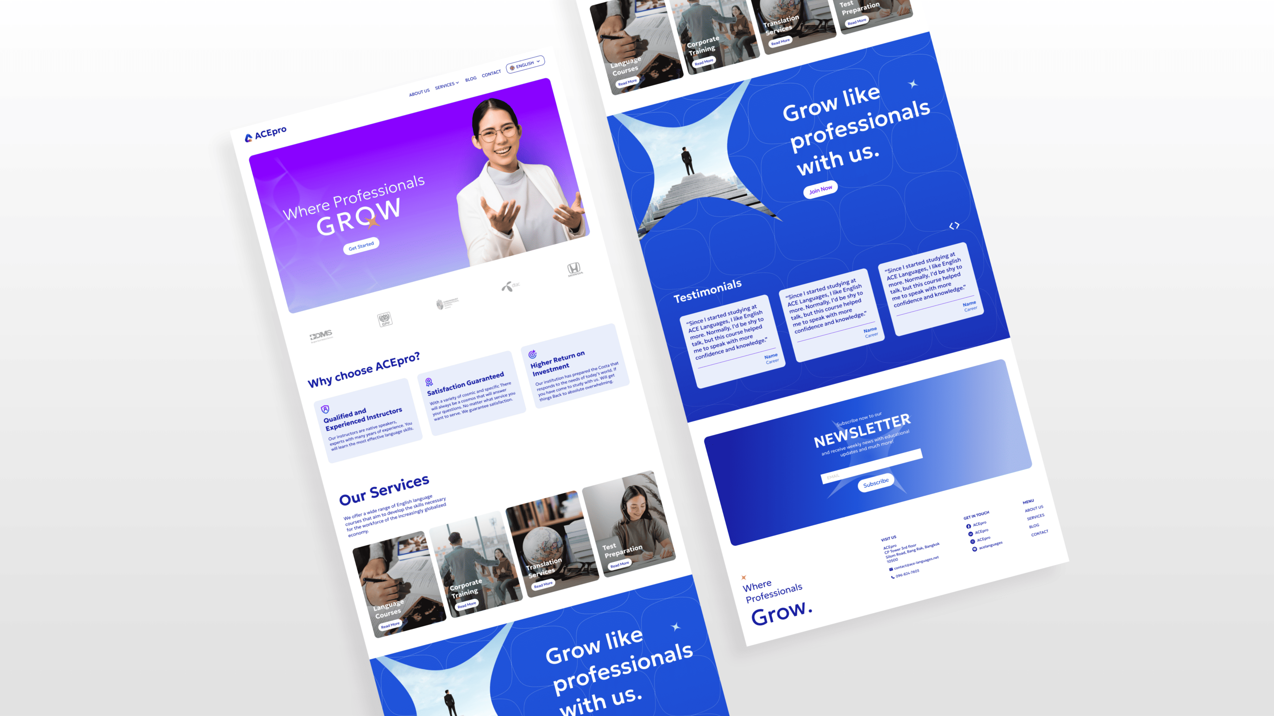
BEP spearheaded the complete re-branding of the educational platform from Voxy to ACE Pro. This strategic transformation included the development of a new Corporate Identity (CI), a modern logo design, and a comprehensive Brand Book. By establishing these foundational brand guidelines, BEP ensured a seamless transition and a consistent, authoritative voice for ACE Pro as they redefined their market position in the professional development and language learning sector.
The design of the logo was designed with the name as the shape of a triangle symbolizes a strong knowledge foundation as well as depicts a one stop service concept. The star at the tip resembles a shooting star, representing learners’ ultimate goal to shine in their career paths.
The color palette of blue, orange, yellow and purple were chosen as they illustrate the sense of trustworthy and professionalism, yet the vibrance encourage powerful creativity and energetic vibe as a supportive educational color scheme.
Work Scope

We'll keep you update with the lastest technology and marketing via Email!


.svg)